Appendix

Topic Route Memo Topic Labels
Identify what, if anything, separates the different expedition periods? We learned from the cluster analysis that there was little separation between periods from the route memo content.
According to (Hands-On Machine Learning with Scikit-Learn, Keras, and TensorFlow, 2nd Edition, n.d.), “Feature extraction is the process of converting raw data into a set of features that can be used to represent the most important aspects of the original data in a compact and informative way”.
There are many ways we can go about feature extraction, using PCA is a common and well established method. PCA reduces complex and high-dimensional data without losing information from any features. In essence, PCA finds the directions in which the data varies the most and then creates new features based on these directions. These new features are called principal components, and they are ordered by the amount of variance they explain in the data. By using PCA for feature extraction, we can simplify the data and make it easier to work with, while still maintaining as much of the original information as possible.
Another way to say this, is that high dimensional data often has properties that we can exploit. It is over-complete, redundant, and does not require the entire data set to be explained. By using correlation and making use of the data structure we can with a compact representation without losing any information.
Here we look to use PCA as exploratory factor analysis, which “...is unrestricted factor analysis in which relationships are described or hypotheses generated” (Peterson, 2000). More specifically, we do not have a defined threshold for the variance to meet. Typically, researchers look for 80% or more of the data to be explained within the first few principal components. If our explained variance is low this does not mean it is “unacceptable”. According to (Peterson, 2000) as an exploratory tool, we will look to maximize our explained variance but not be deterred if it is low, but it will mean that there is an amount of common variance unexplained.
Explained Variance
Exploratory: Total Explained Variance: 32%
Expeditionary: Total Explained Variance: 25%
Transitional: Total Explained Variance: 26%
Commercial: Total Explained Variance: 56%
Social-Media: Total Explained Variance: 23%

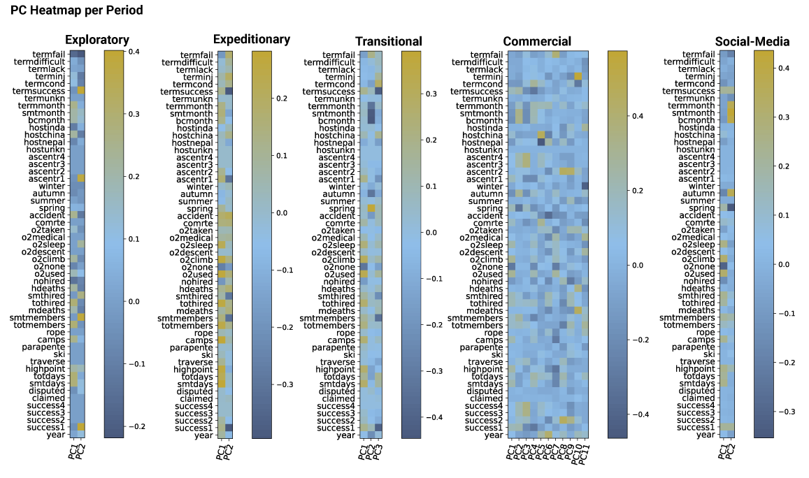
PC Heatmap which shows similar features of per period indicating oxygen use, climbing month, and total of group members are important features of each.
The column weights in each row of the components_ represent the contributions of each feature to that particular principal component. These weights indicate the degree to which each feature affects the direction of maximum variance in the data, and they can be positive or negative.

Example of biplots between transitional and social-media period, both indicate use of oxygen, summit members, total members and climbing months are important features per period.
In a biplot, the arrows indicate the direction and strength of the relationship between the principal components and the original features. The length of the arrow represents the strength of the relationship, and the direction of the arrow indicates the direction of the relationship.
For example, if an arrow is pointing towards a feature with a positive value on the x-axis and a negative value on the y-axis, it means that the feature has a strong positive relationship with PC1 and a strong negative relationship with PC2. The angle between two arrows indicates the correlation between the corresponding two features. If the angle is small, it suggests a positive correlation, while a large angle indicates a negative correlation.
In a biplot, the angle between two arrows indicates the correlation between the corresponding two features. If the angle is small, it suggests a positive correlation, while a large angle indicates a negative correlation.
For example, if two arrows are pointing in almost the same direction, they have a strong positive correlation. On the other hand, if two arrows are pointing in almost opposite directions, they have a strong negative correlation. If the angle between the two arrows is close to 90 degrees, then the two features are uncorrelated or weakly correlated.
This analysis did not provide content in which we can distinguish one period from another or provide context which has not already been noted. We see that the primary principal components like the total members, oxygen use which are easily explained in the EDA. Furthermore, with much of the data not captured in the explained variance, it reduces the reliability of conclusions we can draw with this data. This analysis provides no meaningful way for us to understand why the periods are different and thus was left out of the main analysis.